Alergia - CMU Masters Capstone
PROBLEM STATEMENT: How can we create a solution that provides food allergy sufferers and caretakers with better tools to recognize, prevent, or treat accidental exposure to food allergens?
There are 15 million allergy sufferers in America. 1 in 4 of these have a near-fatal or fatal anaphylactic reaction. There is no cure. These are the realities our Master’s Capstone group uncovered once given our problem statement. For this project I took the lead and helped 4 other student, Aishwarya Ghogare, Woo Kim, Xiaolin Yang, and Xitong Deng, create an application to help improve the lives of those affected by this dehabilitating condition.

Our group started by identifying possible stakeholders and who fit into primary and tertiary categories,
Generating ideas

We identified over 100 product opportunity gaps (POGS) and organized them into an affinity map.
By generating over 100 product opportunity gaps (POGs) and arranging them into an affinity map, it was easy for our group to see where the best POGs were. We clearly saw that the restaurant and general hospitality industry had many touch-points with our users and many opportunities for us to affect change and reduce stress and embarrassment. When weighed against the other POGs we felt hospitality and service was the clear choice.
Research
We knew the user had to be at the center of our design, so while we worked on larger research initiatives, we also hit the ground running and conducted a online survey in a Facebook support group and interviewed 5 users. We found many of the responses had a lot to do with emotions and social issues. We found that many people were bullied and were treated as if allergies were not a real thing. This behavior was reported not only about hospitality workers, but also friends and family. This led to a lot of frustration, when the sufferers were hoping for support. We turned the survey responses and interviews into personas to help guide us through our design process. The personas included sufferers, parents of sufferers and hospitality workers. Our group realized we would have several different user types, and these three personas would be an economical way to think for the majority of them.
Value Opportunity assessment
By evaluating the current state of products and services on the market and weighing those against the desires and needs of our interviewees we found sound major Value Opportunities. The following list was what our users found most important, and where we could affect the most change. This was down from a list of 16 possible areas.
Independence & Confidence: It allows food allergy sufferers to eat safely anywhere without having to rely on others and feel empowered and accepted in social settings.
Security & Safety: It enables sufferers to feel safe and protected in an unfamiliar scenario.
Social: It improves food allergy sufferers' lifestyle by improving their social well-being or creating a new social setting.
Reliable & Accurate: It works consistently equally effective during each use, and it is exact in its information or analysis, providing users with reliable information every time.
Effective: It prevents and treats allergy reactions effectively.
Further ideation
Something I have learned in my career and shared with my group was that no idea is too silly to say in the beginning. It was with this spirit that we used a few different brainstorming activities, such as Crazy-Eights and mind-mapping to come up with over 100 concepts. We grouped these concepts into 12 affinity groups and put the pieces together of how these could each be their own concept. We had ideas in the physical, digital and magic realms. “Magic” was a grouping of ideas that we weren’t sure how or if we could even make them. These turned out to be important ideas, as some ideas like magic goggles that highlighted allergens turned into real ideas about using augmented reality in our concept.

Our group took these 12 concept areas through a exercise to slim down our list. We plotted the ideas on axes of impact and feasibility. Through this activity, we were able to quickly find that 4 of our concepts wouldn’t be viable for the team. With 8 concept directions locked in, we created sketches for each concept, and again turned to our friends on the Facebook Group EpiLife collected 27 responses. The respondents top three idea areas were training and certification (84.6%), smart menu (50%), and smart recommendation (42.3%).
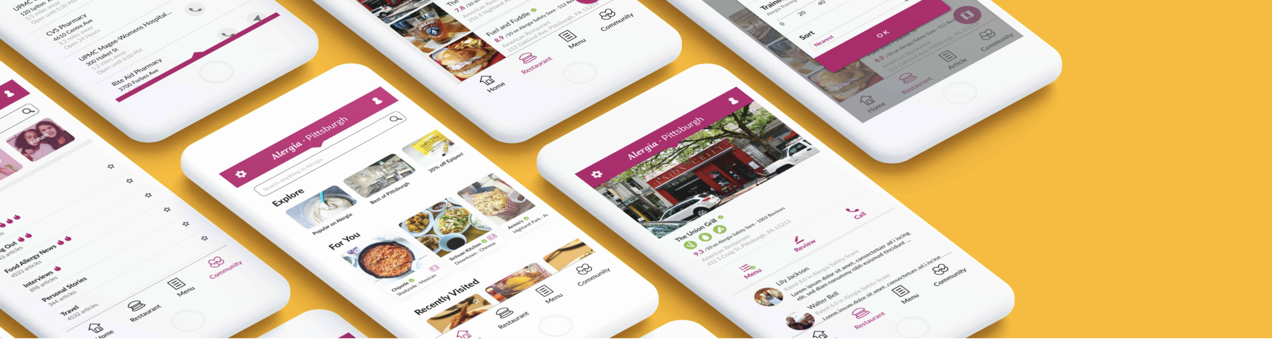
final direction: Mobile app

Our group admittedly had our suspicions that a mobile app would suit our users needs the most effectively, but we wanted to give our process its due. By following our innovation framework and design process, we could leave our decision up to users and metrics. This gave our group a leg to stand on and we were excited to start developing our app.
Interaction Design
Coming from a place of experience and working with less seasoned classmates, we decided I would continue leading our team through the design of the app. The first step was to delineate what pages and functions we need and create an information architecture to define how and where these pieces would live.

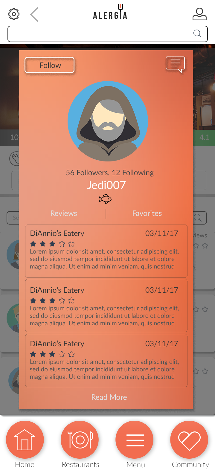
We then produced low fidelity wireframes using pen and paper for quick iterations and feedback. Once we had a solid direction, I suggested we keep the lo-fi theme, but create them in a digital form. Knowing that our users aren’t often just anyone off the street, I knew we had a bit of time to take this step and felt, from experience, that the users would have an easier time reacting to something digital and clickable. Our wireframes included 18 interfaces covering key features.
Try the interactive prototype here.
Lo-Fidelity Sketch/Invision wireframes:
Acting as the lead designer, my goals were creating consistency, following best practices, ensuring ease of use and truly solving problems for our users. The design exercise was a great experience and free from worrying too much about technical constraints or opposing views from stakeholders that had anyone other than the user in mind. Although this isn’t the most realistic pursuit, it did allow us to create something that was meaningful and pure. Taking into consideration technical and human capital constraints, our next step would be to create a roadmap and prioritize features to create an MVP and beyond.
Feedback

Joe and Jenn Liberatore, walk through some tasks on our low-fidelity prototype and provide feedback. We were able to do this exercise with four groups of potential users.
As with virtually all user research sessions, we found that not everything was perfect from our first attempt. Having experience with this in the industry I was able to coach my team on how to take the feedback and use it to learn and improve. This checkpoint gave us many valuable points of feedback. A few of the discoveries that we implemented were:
We allowed users to switch between family accounts within the profile page, making it easier to eat out with food allergic family members.
We also moved Profile from the bottom navigation bar to the top right corner, and instead put Menu in the navigation bar. This is because users found it was hard to find the menu within the restaurant page. By doing this, we also made the menu more prominent.
We allow users to select their severity over each allergen through a sliding bar instead of only a binary on/off.