CMU masters capstone (2018)

The background details
CMU Masters Capstone
January 2018 - May 2018
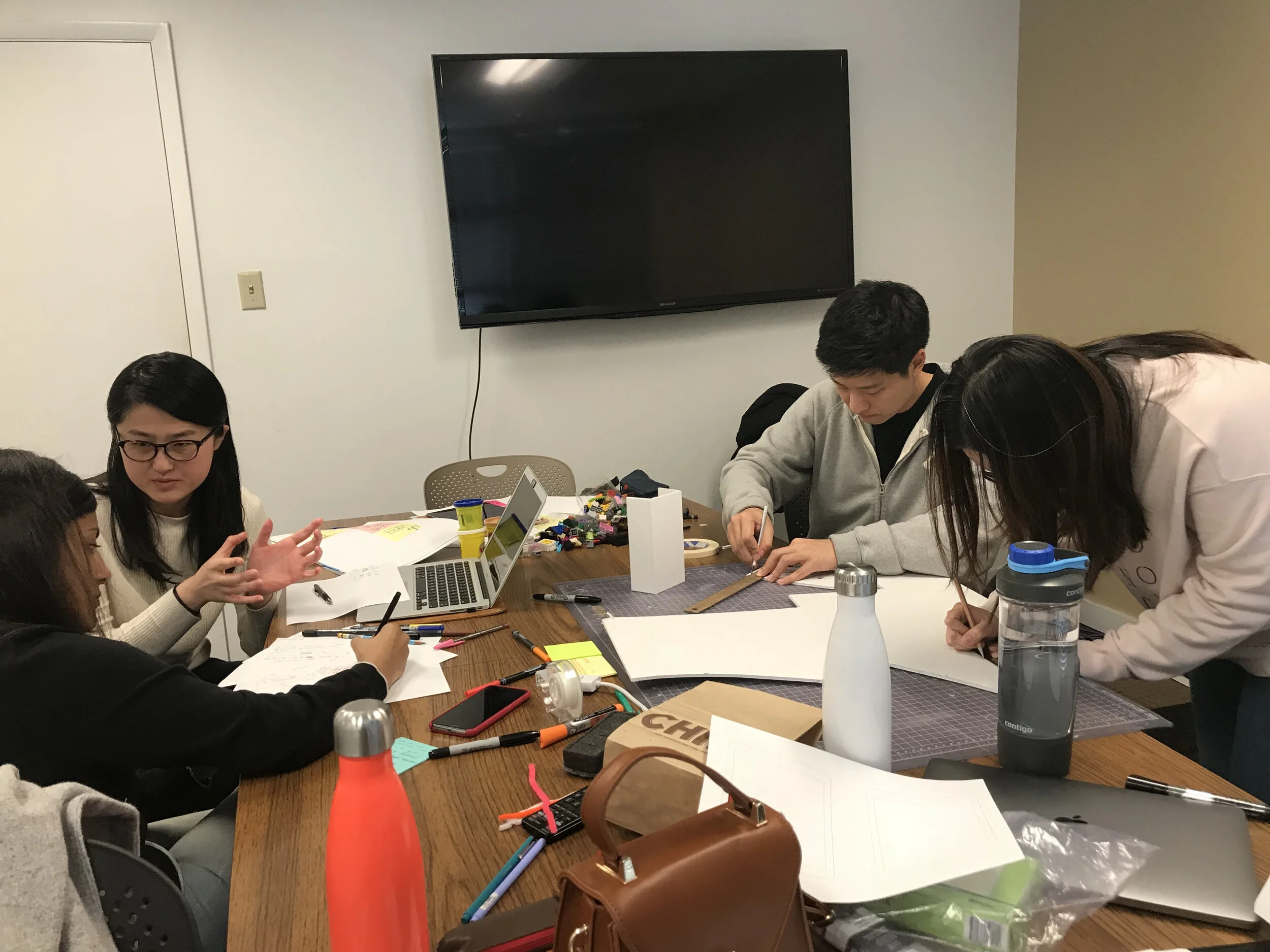
Team
John Vanderveen - Team Leader, Design Director
Aishwarya Ghogare - Engineer
Hyungwoo Kim - Data, Marketing
Xiaolin Wang - Designer
Xitong Deng - UX Designer
Problem Statement
How might we create a solution that providers food allergy sufferers and caretakers with better tools to recognize, prevent or treat accident exposure to food allergens?
Stakeholder Mapping
Our group started by identifying possible stakeholders and who fit into primary and tertiary categories.
Divergent idea generation

We generated over 100 product opportunity gaps (POGs) and affinity clustered them. We noticed that the hospitality and service industry had many touchpoints and opportunities to reduce stress and affect change.
Primary Research

Persona Development

Value Opportunity Assessment
We did an analysis of products and services in the space currently and weighed them against the desires and needs of our interviewees/ The following list was what our users found most important, and where we could affect the most change. This was down from a list of 16 possible areas.
Independence & Confidence: It allows food allergy sufferers to eat safely anywhere without having to rely on others and feel empowered and accepted in social settings.
Security & Safety: It enables sufferers to feel safe and protected in an unfamiliar scenario.
Social: It improves food allergy sufferers' lifestyle by improving their social well-being or creating a new social setting.
Reliable & Accurate: It works consistently equally effective during each use, and it is exact in its information or analysis, providing users with reliable information every time.
Effective: It prevents and treats allergy reactions effectively.
This list served as our guided in making sure our solution was appropriate, useful and delightful for our users.
Further Ideation

I facilitated ideation sessions using crazy eights, mind mapping and others to come up with over 100 concepts quickly. I encouraged my group that no idea was too silly; one idea in the “magic” category was magic goggles, and that inspired a more realistic idea of using augmented reality as part of a solution.

We formalized our categories into more succinct concepts and plotted them on a impact/feasibility matrix. This quickly highlighted some winners. We then turned to another survey withe previous respondents. The respondents top three idea areas were training and certification (84.6%), smart menu (50%), and smart recommendation (42.3%).
Final Direction: Mobile App
Based on what we had discovered, we felt a mobile app would be the most impactful solution, if we could create the features we envisioned.
Information Architecture

My group quickly realized how important content strategy was. I helped them understand how to create navigation and explained different levels of pages and the importance of findable and intuitive navigation. I served as a director and mentor to critique iterations and ask questions.
Lo-fi Wireframes

Acting as the lead designer, my goals were creating consistency, following best practices, ensuring ease of use and truly solving problems for our users.
Testing with real users

Testing with real users allowed us to find real issues. I was able to coach my team on how to take the feedback and use it to learn and improve. This checkpoint gave us many valuable points of feedback. A few of the discoveries that we implemented were:
We allowed users to switch between family accounts within the profile page, making it easier to eat out with food allergic family members.
We made changes to the navigation layout and menu location.
We allow users to select their severity over each allergen through a sliding bar instead of only a binary on/off.
Further iterations

My main feedback on this iteration was centered around navigation and visuals. The circles for navigation took up more space than needed and weren’t an established pattern. The design was also skeuomorphic and the low saturation of colors made it feel dated. Finally, there was no indication of states in buttons.
Allergia making an impact
Final Iteration

We weren’t able to finalize the last iteration before our final presentation, but created a more modern, usable application after.