Harland Clarke Check Reordering Application
Harland Clarke is a leading provider of payment solutions, serving 43 million end consumers and 6 million businesses. They came to Springbox to get an innovative new look and functionality for their check reordering web application. Having some major banks as clients, HC needed to provide an easy, seamless and fun experience for their clients and ultimately, the end users.
Springbox Design
Original Site

The site that we worked from was visually outdated, not responsive, and contained poor information architecture and content strategy. We needed to create an experience that was visually compelling and easy to use across all devices.
Our design was centered around ease of use and accessibility. We used strong colors and visual elements to show the user what to do next. We also kept the check as the main focal point, so users could see what their customizations were doing in real time.
User Flows
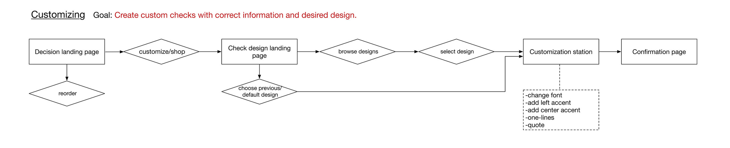
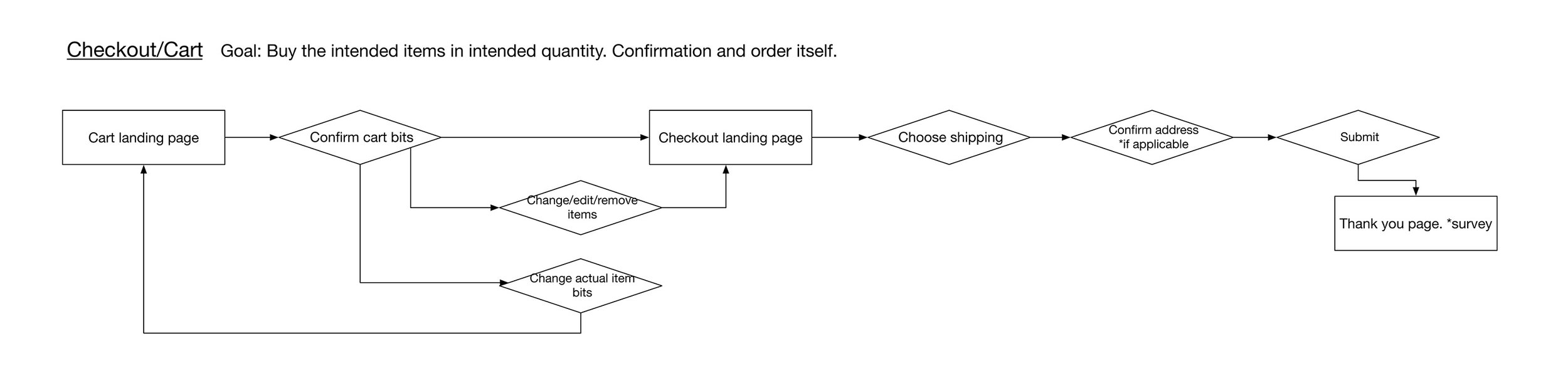
Page Goal Flows


Full User Flow

Special attention was paid to the user flows in our design. We found the previous site had issues where users would get "stuck" and abandon the experience without converting to buyers. We wanted the flow to be as simple as possible, while still allowing more invested users to explore enhancements they could add to their checks, without ever getting stuck in a corner. The flows were inclusive of specific user flows and shells that represented larger, common funnels.
Wireframes

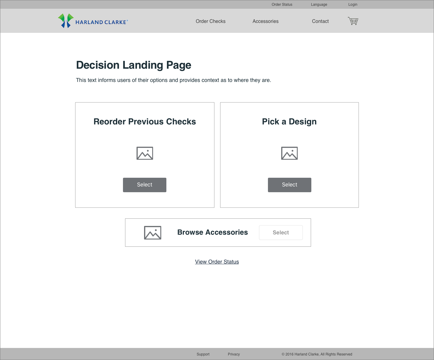
We created wireframes, first on whiteboards, then using Sketch. The wireframes were low to medium fidelity and were intended as a tool to get client approval and move on to a higher fidelity prototype. The prototype needed to be high fidelity as we did user testing and handed off the file straight to their development team, without a continuing relationship in place.
Mobile Experience

Mobilized
By using Harland Clarke's data, we found that mobile was a major platform used to order checks for their users. We kept the user at the center of the equation when making all pages, making sure nothing was too small on a mobile device and the experience looked great on both mobile and desktop.
Legibility was a guiding concern for the new experience. Most people know the frustration of not being able to see or read a site on mobile and trying to zoom in, only for the page to refresh and lose progress. It is easy to imagine why the conversion wasn't strong. After our solution, the site was remarkably better in terms of usability and conversion, measured both by usability testing and data in the wild.