Business Banking financial health quiz (2019)
The background details
Omnichannel initiative at Huntington

Huntington had an overarching initiative to create an Omnichannel experience. With digital becoming the primary focus and branches feeling more and more dated, the time to strike was now.
Agile Practice & My Role
A part of Omnichannel or OMNI being set up, an Agile practice was being implemented for the first (technically second, but for real attempts, first) time at Huntington. I worked as the UX lead and interaction designer. This means I was a core member of our agile pod as well as the manager of the UX resources.
the Opportunity

Tool Modernization
Huntington recognized Small Business owners as a very important part of their business. There were also complaints from the branch bankers that the tools at their disposal were unsatisfactory for such a difficult process. Coupled with those factors, there were also new products being offered that would add additional complexity to the sales and enrollment process. Therefore, Business Banking Financial Health Quiz (BFHQ) was the highest priority and most complex product in the backlog.
the goal
Seeing this opportunity for growth in current product option and new product acquisition, the project’s Key Performance Indicator was a 15% increase in Business Banking Enrollment and a decrease in complaints from branch bankers.
The Process
Experience Owner created User Stories

A zealous Experience Owner (Product Manager) created dozens of user stories hoping to save the team time. As this wasn’t good practice or taking advantage of the cross-functional nature of the team, I pushed back, using workplace negotiation skills.
Introducing Design thinking and collaborative Roadmap Creation
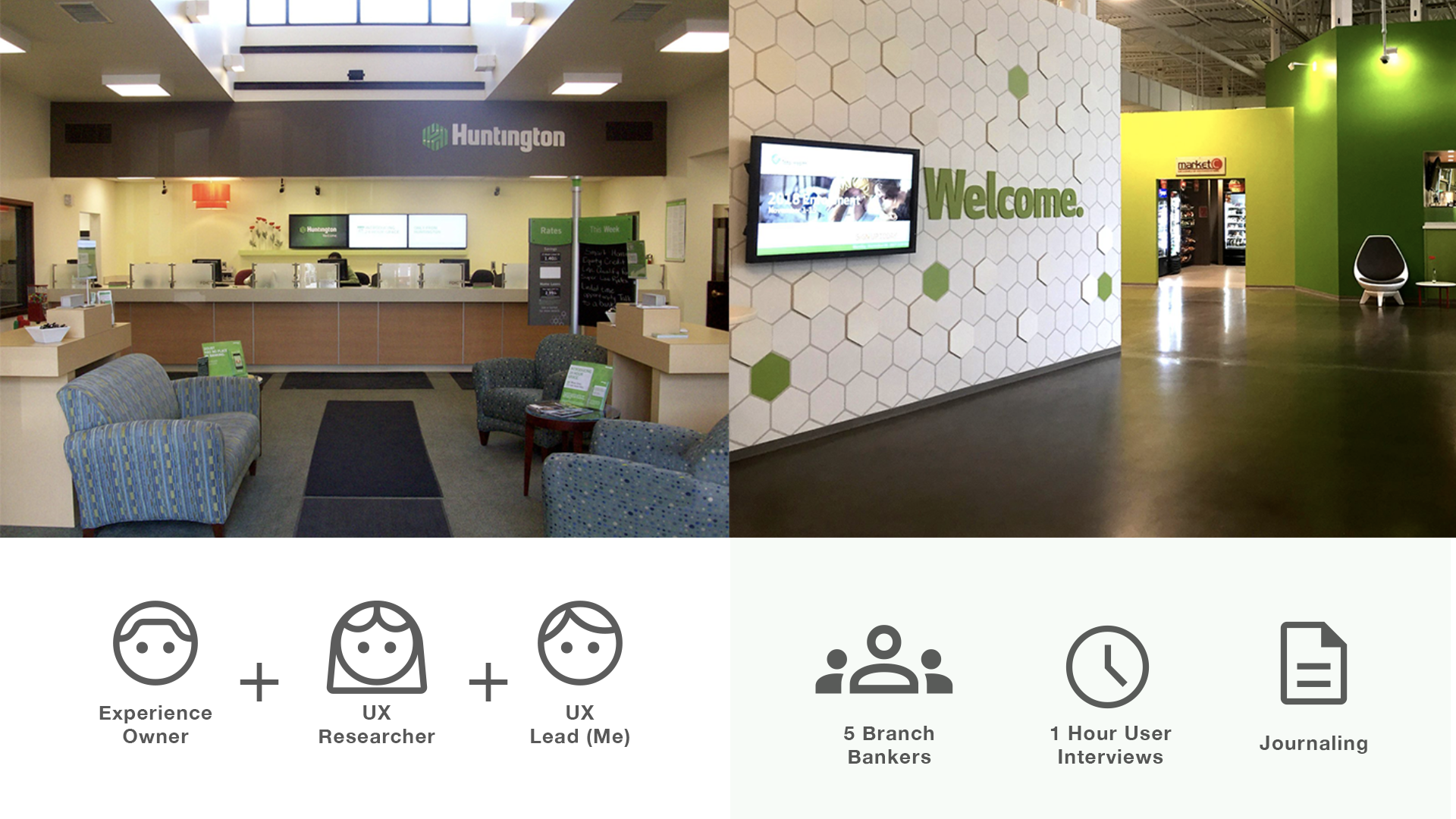
After an open discussion of best practices, we went as a team to a new prototype branch and an existing Huntington branch to do observation, interviewing and learning about the user. I recommended contextual inquiry as well as journaling to work through privacy concerns and limitations.
We found even more disparate systems and technologies than we expected. We also learned part of the branch bankers’ goals were to deepen relationships with customers. It was a hard balance for them to know when to build relationships and when to sell.
Flow and Wireframes

Based on our research, I began visualizing the flow by creating simple, low fidelity wireframes. I started with pages that already existed in our salesforce experience. I then organized the user stories into themes which would become pages. I noted pages that were out of scope (outlined in red) and user stories that had issues.
I then consulted with Salesforce developers to find out what modules would be achievable in our timeframe and created very high level wireframes.
Wireframe Review

All wireframes started on the whiteboard in our shared space to provide a mechanism for architects, developers and business owners to raise any issues and verify that the functionality was appropriate and possible. To bring those abstract concepts into a more understandable medium, I created a low fidelity prototype in Axure with the more important interactions and logic built in to represent some potential issues. I presented these at our Sprint Review.
By taking this step, I uncovered some nuance in the way the calculations worked. It became clear that the addition of certain services could change the recommendation of deposit products. Concerns were also raised by the lead architect, who was worried that a piece of the functionality would cause frustrating delays and we might want to rethink the approach.
Tech considerations

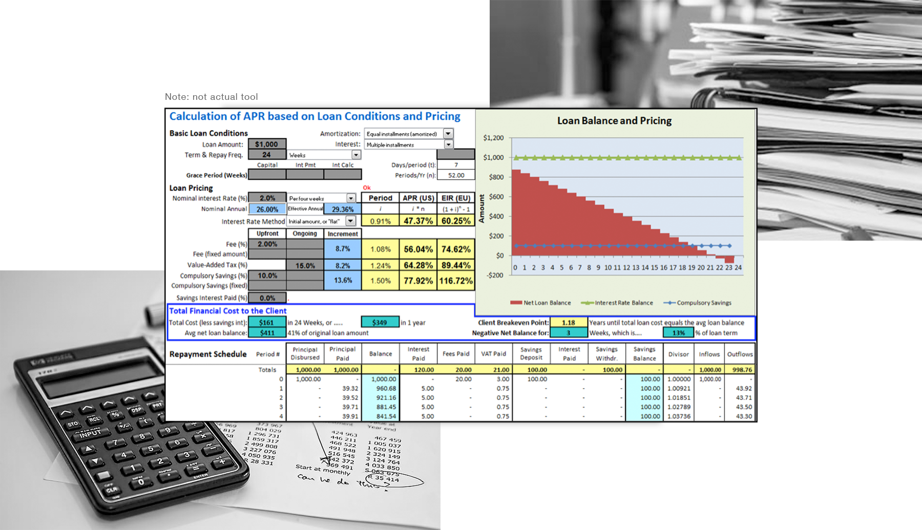
Many technical considerations come into play when working with disparate systems and banking regulations. Salesforce had been chosen as our CRM before the project began. Our calculations for recommendations could not be done locally, because of security concerns. The way Huntington’s tech stack is set up causes these calculations to be passed through Service Oriented Architecture (SOA). Due to this, the architect was worried that the many successive calculations that could potentially be performed would frustrate the banker and customer. There is also a limit of service calls we can make in any given system in a timeframe. This, however, was expected to be moot due to the lower volume of business clients.
Logic Complexity

There are several distinct pages in BFHQ. Their purposes are to:
Get to know the customer
Explain beneficial services
Recommend deposit accounts and credit cards.
The experience can also create opportunities and referrals for the banker or other bankers. The business unit defined many interdependencies which required recommendations to be driven by many different factors and created opportunities to change metrics on the fly. These considerations drove ideas like a “scoreboard” that would allow users to update previous page information from anywhere in the experience, and pulling the services page earlier to let it drive checking recommendations.

Prototype testing
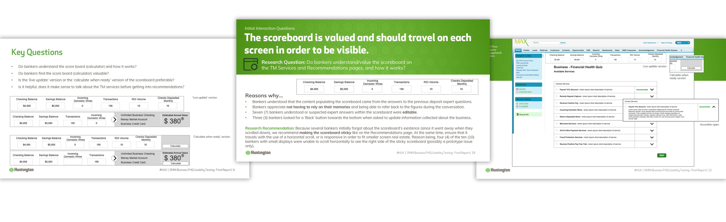
Working with one of our UX researchers, I created key questions and a testing plan for 10 branch bankers working in the field. We found that based on this sample, the bankers preferred:
Waiting on a delay, instead of using a “calculate” button.
Breaking Available Services questions into a different page.
Displaying a floating calculator, deemed the “scoreboard” on all pages for easy edits to responses, which can drive different recommendations.
Design Iteration
Results
The rollout of Business Banking Financial Health Quiz at Huntington led to a 20% increase in Business Banking product enrollment. We also followed up with many of the bankers we talked to for research and found that the tool had given them confidence and streamlined their workflow, while comforting them with consistency.

Future Iteration
Huntington committed to a transformation, but in phases. Proving out the tool itself was important before spending more time on visuals. I advocated for a more modern look that was on par with what was being developed in other parts of the business.
If Huntington wanted a true Omnichannel experience, I argued, all tools and experience should match. With the positive results from the first version, the case for a “Best” and not just “Better” experience was strong. Ultimately, I moved on to CoverMyMeds before this phase.